Redefining a global workforce company
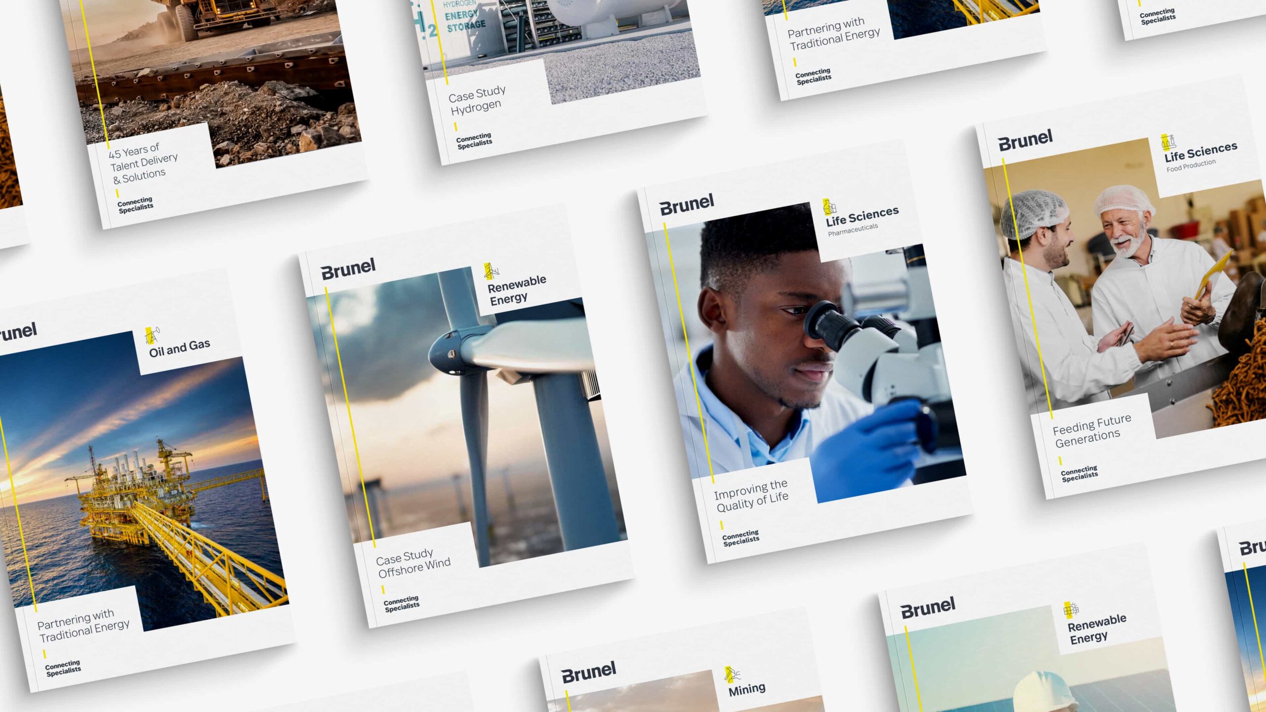
After launching their new global strategy, Brunel noticed their visual identity was not up to par with their ambitions and goals.
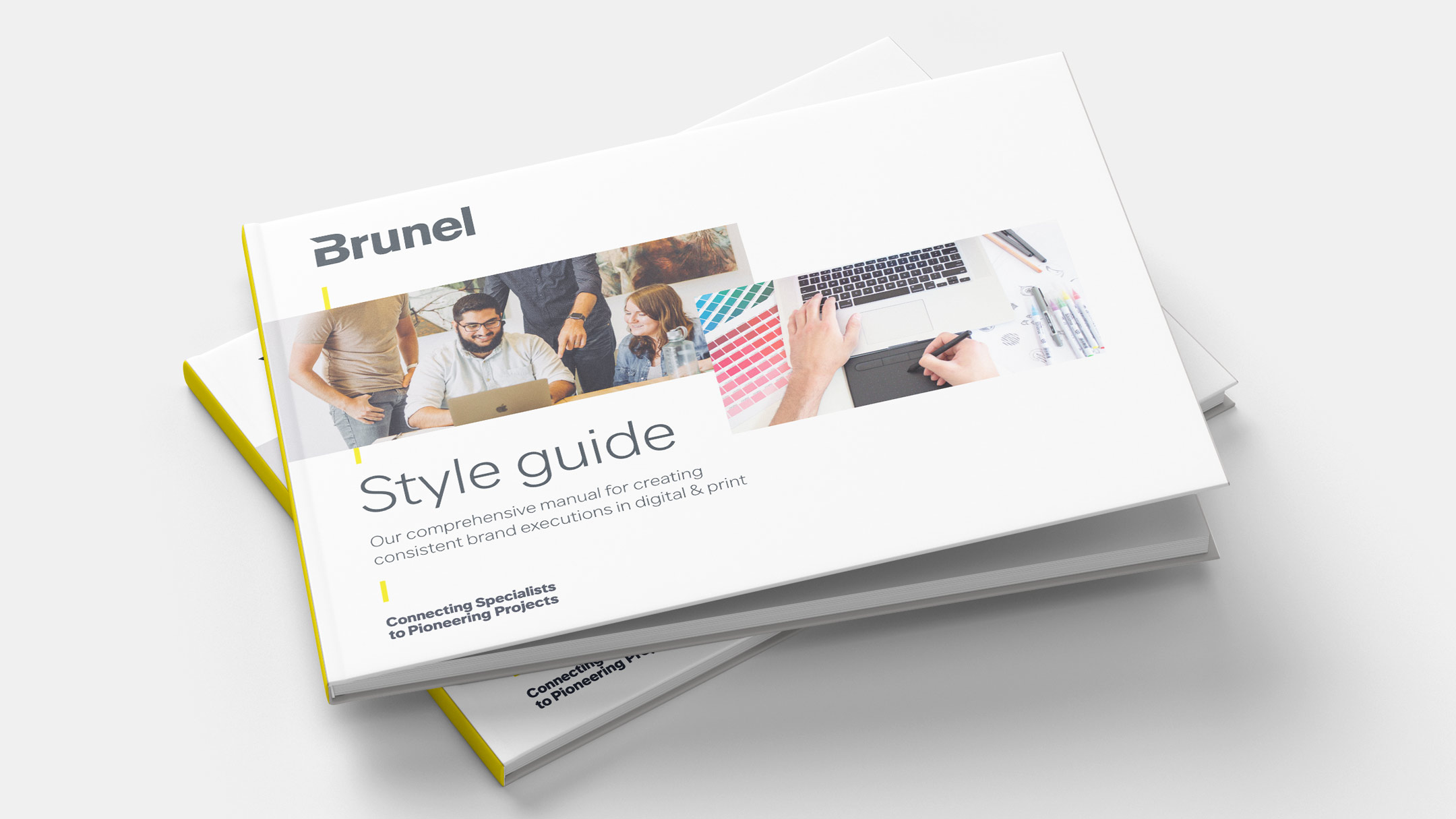
Brunel approached me to lead the rebrand and allign it with their new value proposition 'connecting specialists to pioneering projects'.
The new brand identity I created has this strategy ingrained in every aspect of the brand and its executions — and is in use today in 120 offices and by 12.000+ specialists globally.
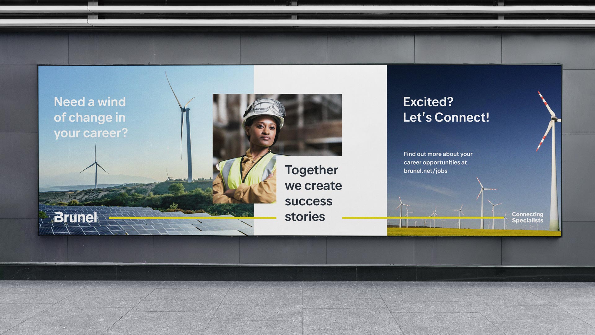

A visual identity that emphasises connection
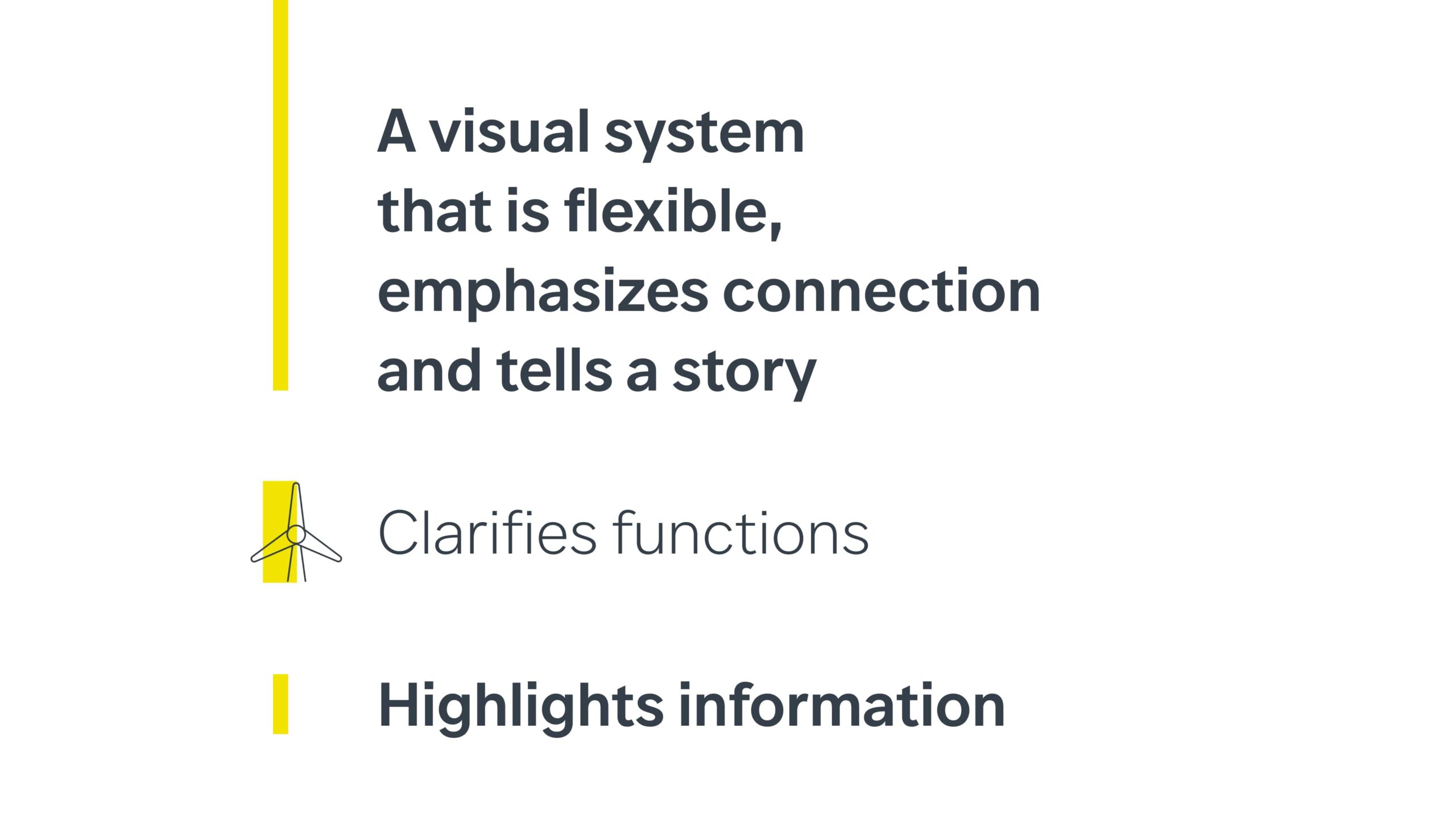
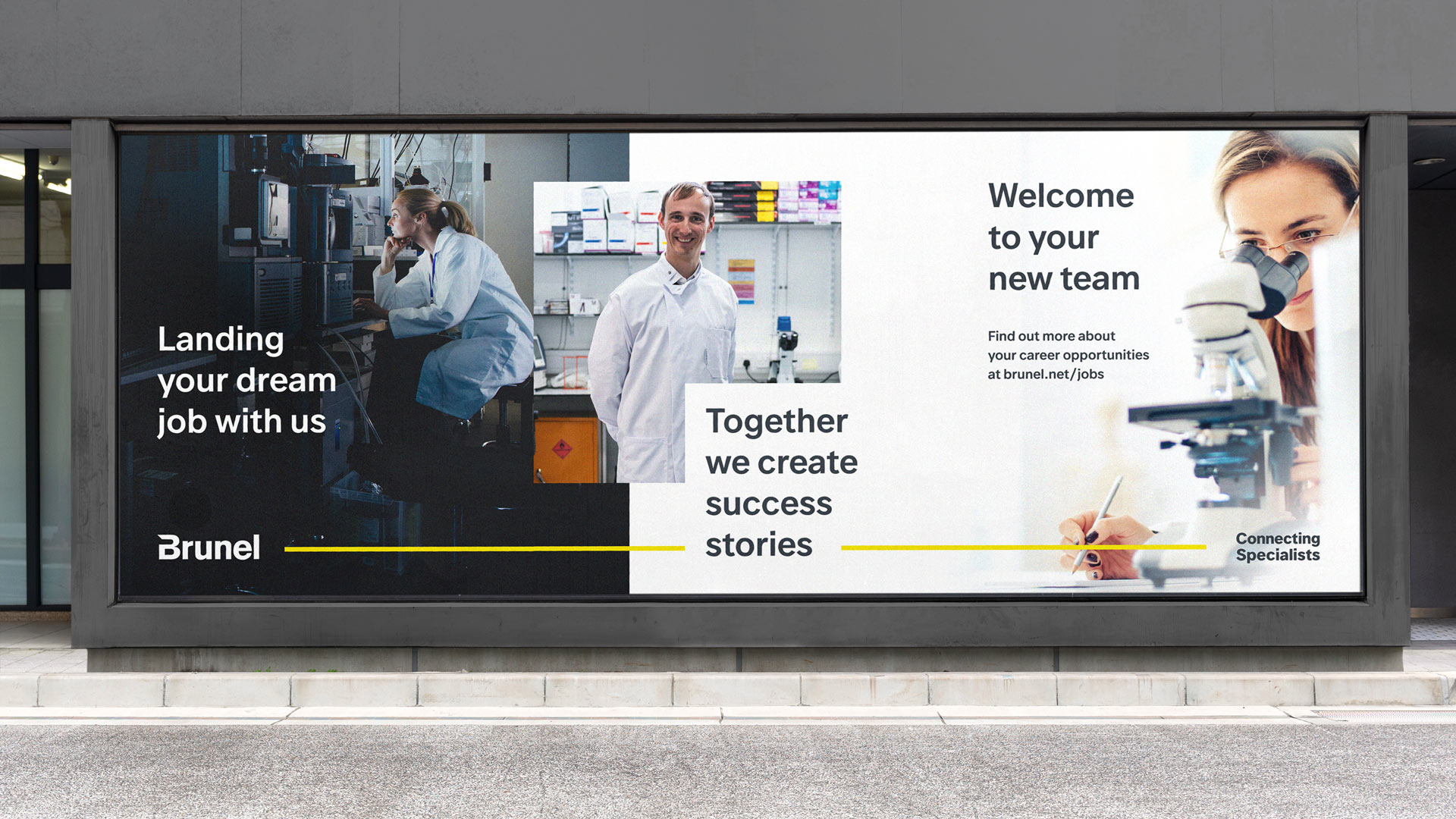
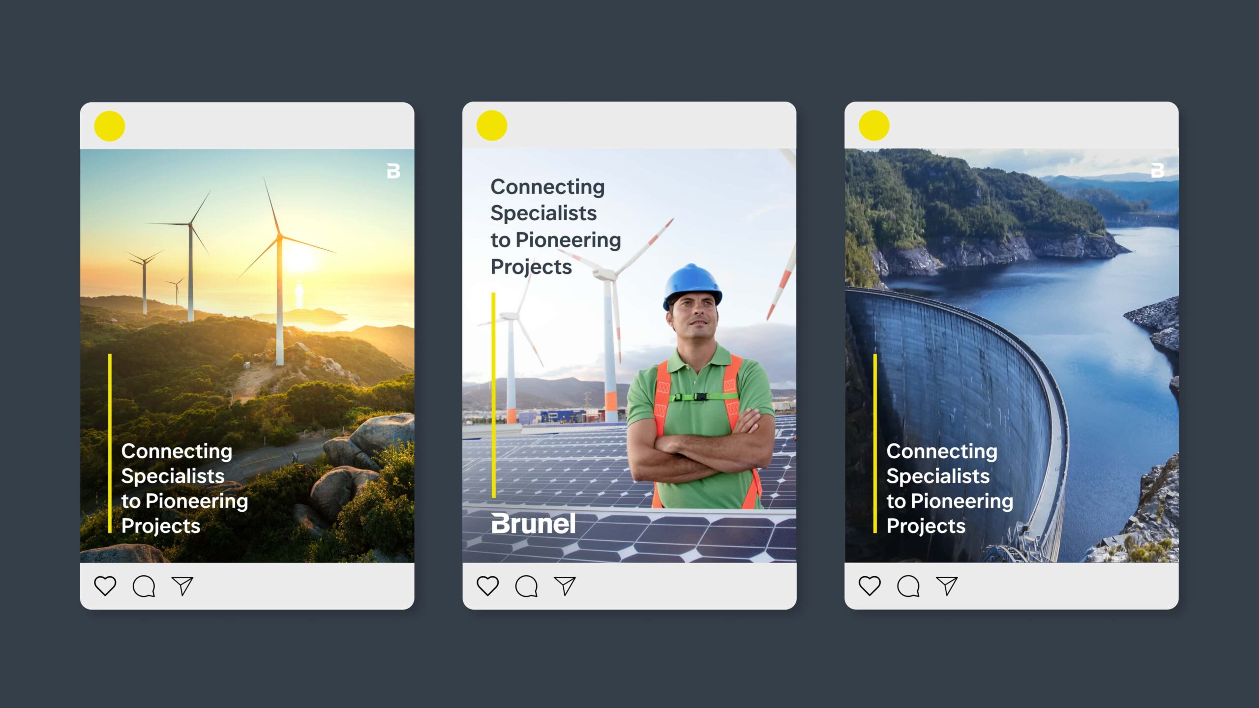
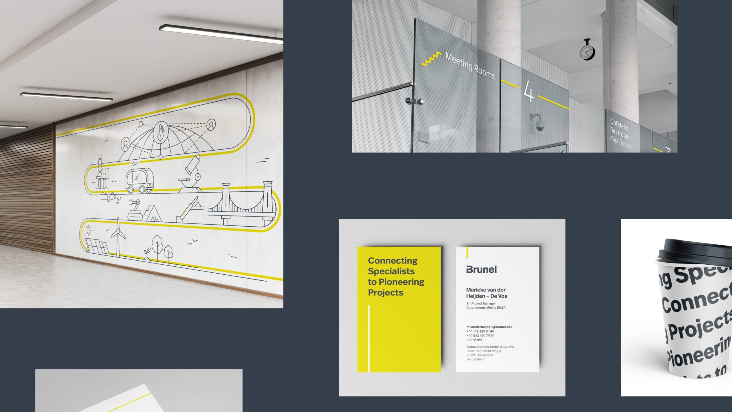
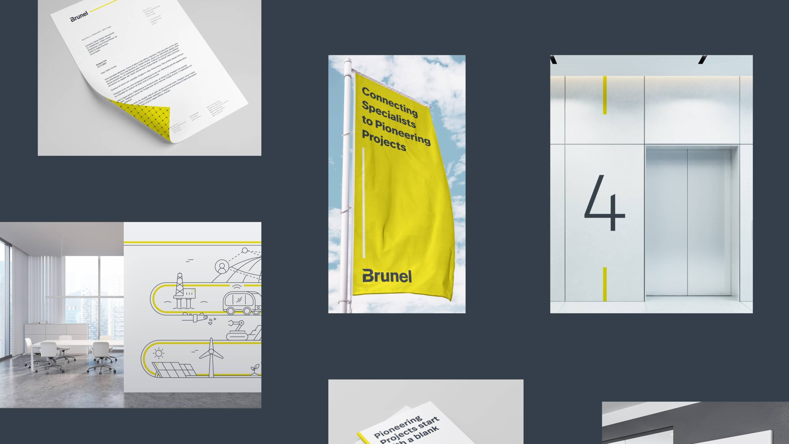
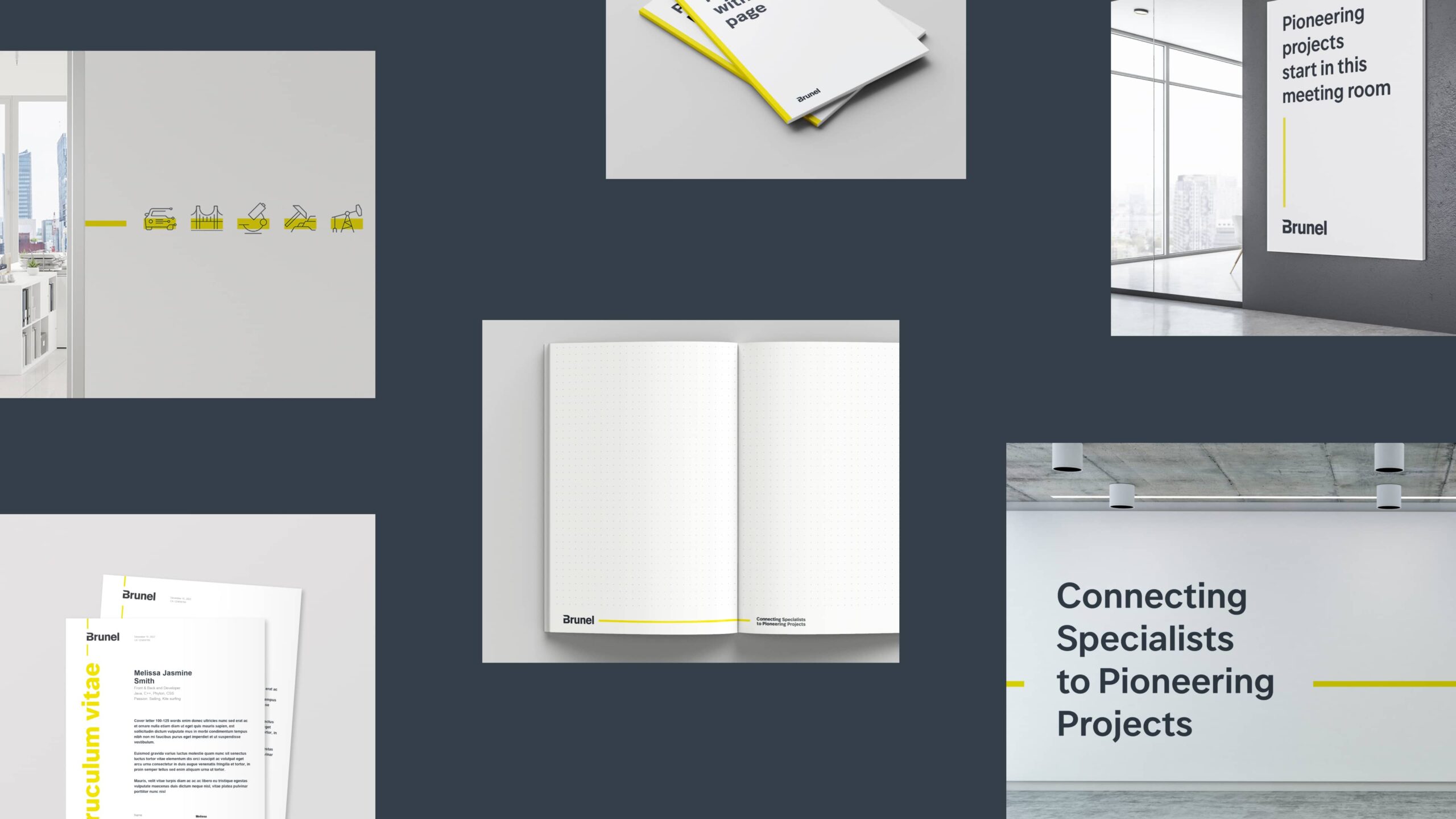
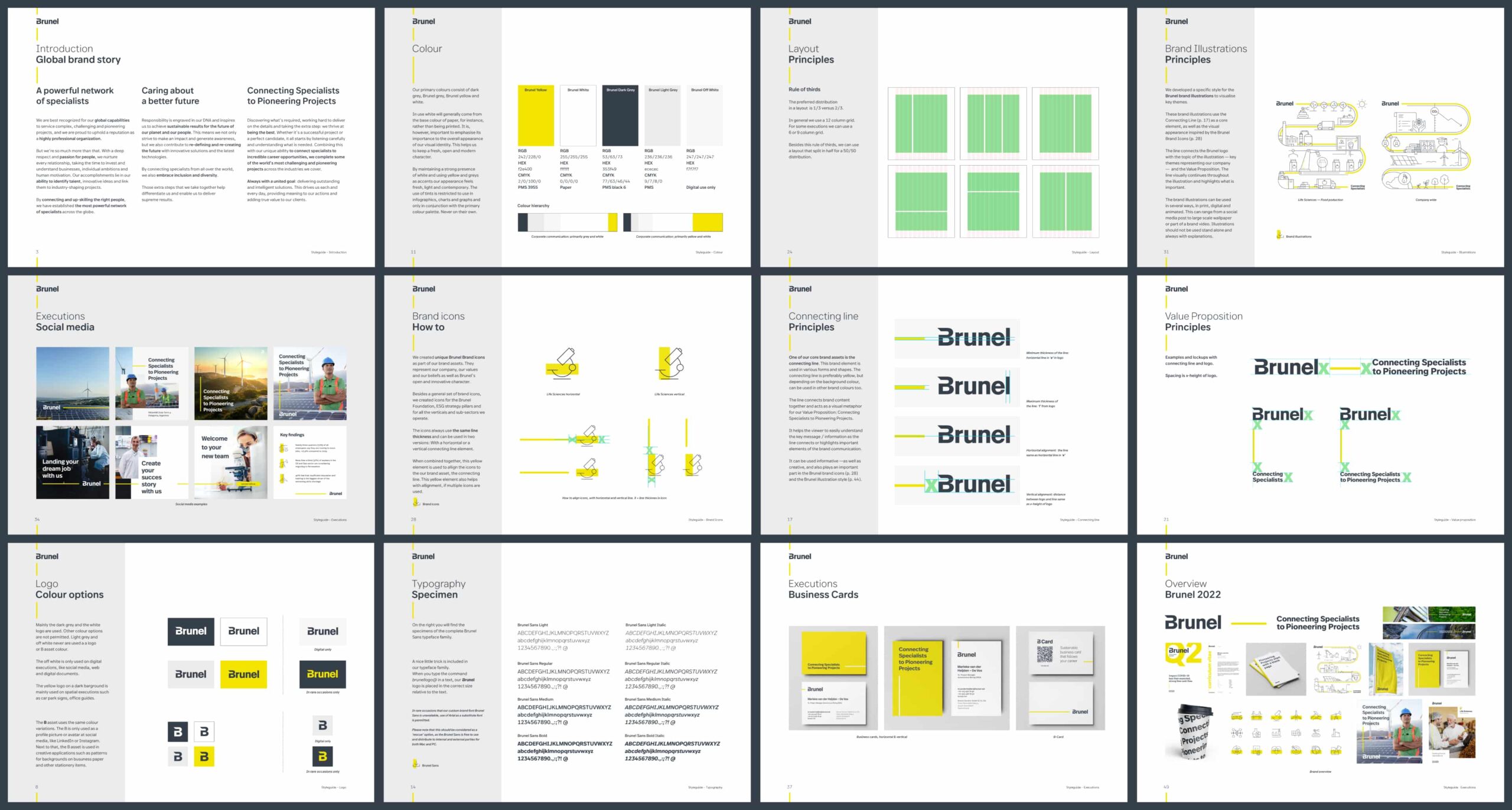
The line, connecting the logo to the value proposition, plays a central role in this identity. This brand construct acts as the visual metaphor for connection and is used in various shapes and forms — both creative and informative.
Creating Brunel Sans
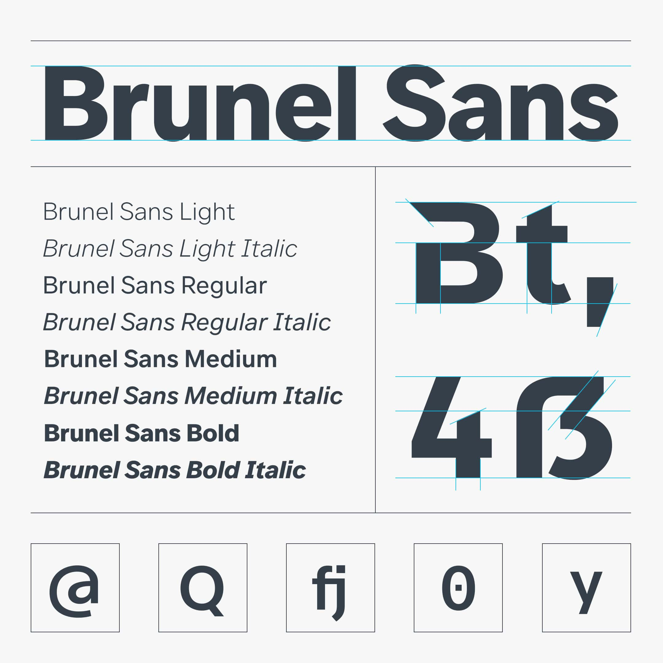
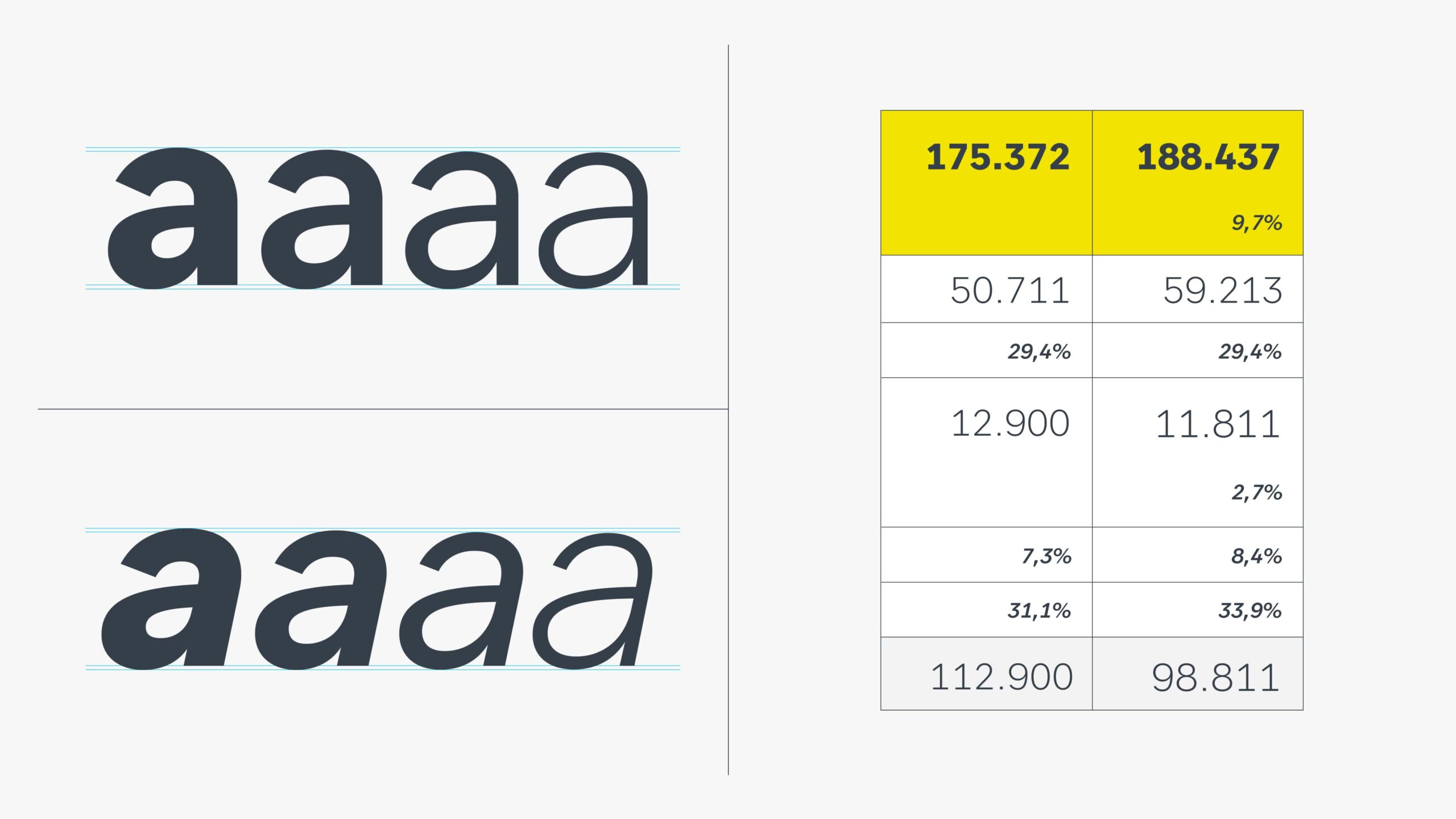
The bespoke typeface family takes it’s design cues from the simplicity and clarity of the Brunel logo. The Brunel Sans was developed with one thing in mind: A modern, digital first typeface that is the foundation of the new global brand identity, connecting specialists worldwide.

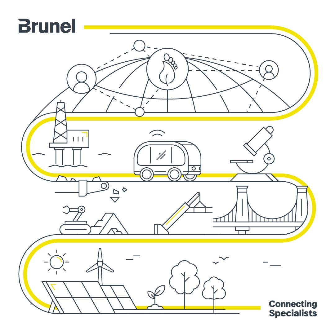
Visualising key ESG themes
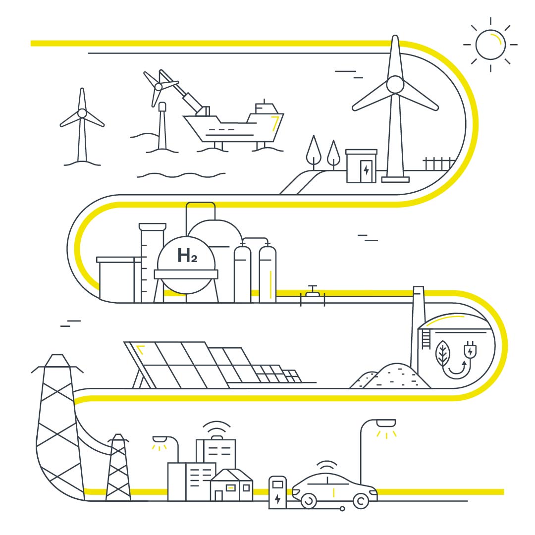
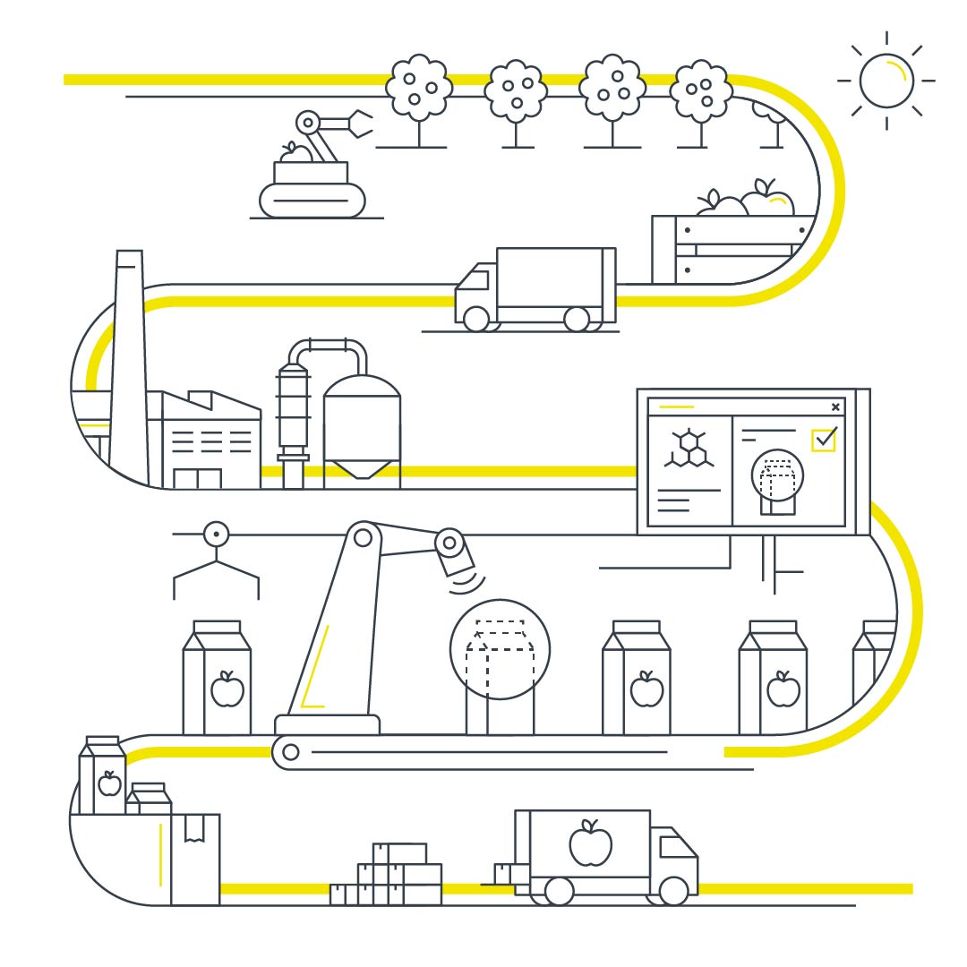
An extensive set — plus animated versions — of brand icons and illustrations were created. They emphasize Brunel's innovative character, visualse key themes and company divisions. The connecting line plays a vital role in both icons and illustrations.
Digital greeting cards
We would like to thank the Brunel Marketing team for their trust and willingness to take this massive leap forward.
+ Rebrand
+ Creative Direction
+ Visual Identity
+ Brand Toolkits
+ Typography
Client
Brunel Global Marketing, Düsseldorf
Nicole Kirleis, Linda Paul
Creative Direction, design lead
Simon van de Rijdt
Additional design
Crisja Ran, Vincent Venema
Typeface Design
bBox Berlin, Ralph du Carrois, Anja Meiners
Brand illustrations and icons
Gino van Lierop
Motion Graphics
John Beckers
Project Management
Terry Stijvers, Celine Wagenmakers
Account
Lisa Pilley
A big thanks to Arno Stols (Magenta Films)
for introducing us to the client
Like to work with us?
FormFactor Studio
Lijnbaansgracht 297H
1017 RN Amsterdam
Phone: +31 6 24 56 30 56
Email:
instragram: @formfactorstudio
© formfactor studio 2023